Solecreator.com - a good idea, terribly executed (updated with response)
29 Apr 2010In response to a comment below from solecreator.com I feel I should clarify that the site is in beta and issues are still being resolved. Personally I don’t feel this excuses the problems described although it does go some way towards explaining them.
To my mind using a BETA product as a public release for an ecommerce system is reckless and that paying customers should not be used as guinea pigs, if you know something isn’t right (indicated by it being labelled beta) then you should wait till it is before releasing, clearly our opinions differ.
I do however appreciate the time take to respond to my opinions. The original review:
Having an interest in cool websites, shoes and making things, a website that enables you to design a pair of shoes online and have them arrive at your door sounded a very appealing idea. If only the reality of solecreator was that good.
Online Experience
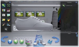
On arriving at solecreator you are met with a largely flash based website which I feel is acceptable for a site that’s going to have this level of interactivity, the initial process involves choosing your sex, size and model of shoe from a selection of named and unnamed brands including Converse and Vans. On completion of basic shoe selection you can decide if you want a quick tutorial, I opted not to use this and didn’t regret the choice. Now the main designer page is reached (shown below).
The designer emulates a generic image editor and is logically laid out with appropriate tool tips to explain the essentials.
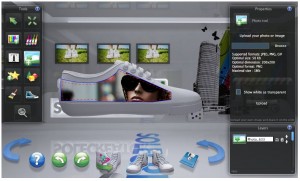
I started out by trying to place one of my photos, which took three attempts to upload the image, the application freezing on previous attempts. The system also does not recognise uppercase file extensions so will not allow the upload of images with a .JPG extension on an operating system which uses case sensitive filenames (like osx/linux etc). Alarm bells also started ringing when the optimal image size was given as 50kB 200px x 200px which seemed to my mind very low for an (apparently) high quality print application.
Once the upload has succeeded the image is inserted onto one side of the shoe and can be scaled, rotated and repositioned. This aspect of the editor makes it very difficult to get an idea of how the image will look on the shoe as it does not make any attempt to wrap the image to the shape and just shows a cutout image floating infront:
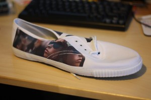
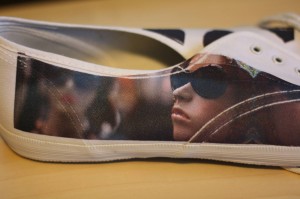
While as a web developer I appreciate this is not an easy thing to do the application makes it very difficult to get an exact idea and no refunds are given for bad design! After you have completed battling with the editor you go through a normal paypal type checkout and given an estimated delivery date then just sit back and wait. I paid my £28.98 for the cheapest paid and then sat back and waited. In addition to my experience I've since noted other annoyances with the website like address form allows submission of the form with the placeholders in it, so my address on my invoice is listed as <my address> "Your address 2 (optional)".....etc.


