Styling the HTML5 Meter Tag Using the Shadow DOM
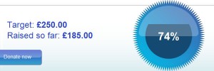
19 May 2012Almost three years ago I read an article on html5doctor describing the meter tag, during the course of the article an example is given of the http://www.justgiving.com/ gauge of how near you are to your target:
The article goes on to suggest this would be an ideal use case for the meter tag, however at that time it was impossible to style the meter tag to look like this. This afternoon after discovering that shadow DOM support had made it into Chrome stable I attempted to recreate the Just Giving meter using no images and without a mess of divs.
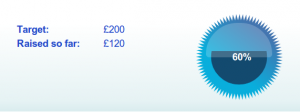
This is the result, one I’m pretty happy with, I haven’t really made much attempt to style the surrounding areas, I just wanted to concentrate on the (frankly rather cool) meter:
Or see a live demo.
My CSS version uses the shadow DOM to remove the default styles from the meter, colour it blue then uses a SVG mask to make the circular centre meter. The surrounding border is an SVG star rendered as the background of the element.
Code
Full code can be seen in this GIST.
The code used is quite simple:
<html>
<head>
<style type='text/css'>
/**
*
* General Page CSS Omitted
*
*/
/* The main meter element and star */
#raised {
-webit-style:none;
position: relative;
background-image:url(star.svg);
height:150px;
width:150px;
position: absolute;
right:20px;
}
/* The overlay shadow */
#raised:before {
content: '';
background-color:#fff;
opacity: 0.2;
height:60;
width:115;
position: absolute;
top:0;
left:17.5px;
z-index:5;
margin: 16px 0 0 0;
border-radius: 100px;
border-bottom-right-radius: 10px;
border-bottom-left-radius: 10px;
}
/* The percentage */
#raised:after {
content: '60%';
position: absolute;
top:65px;
right:36%;
font-family: Arial, sans-serif;
font-weight:bold;
color: #fff;
}
/**
* Shadow Dom Elements
*/
/* The central circle */
#raised::-webkit-meter-bar {
-webkit-transform: rotate(270deg);
-webkit-mask-image: url(circle.svg);
background:none;
margin: 25px 0 00px 25;
width:100px;
height:100px;
}
/* The area of the meter indicating the value */
#raised::-webkit-meter-optimum-value {
background:#134A6F;
}
</style>
</head>
<body>
<article>
<div class='column left'>
<dl>
<dt>Target:</dt>
<dd>£200</dd>
<dt>Raised so far:</dt>
<dd>£120</dd>
</dl>
</div>
<div class='column right'>
<meter id='raised' min='0' max='200' value='120' title='pounds'>60%</meter>
</div>
</article>
</body>
</html>SVG files were generated using inkscape and can be seen in the live demo.
Limitations
- The percentage cannot currently be calculated using CSS, calc() doesn't work using two attr() values.
- This example requires a recent version of Google Chrome
- In this example I've modified the mark-up from the original example to just use one meter tag but preserved the
- </li>
</ul>
While this approach would not be suitable for use in a live site yet without a great deal of graceful degradation it is a very good example of the power of HTML5 & CSS3 and shows the ability they have to combine semantic mark-up and amazing presentation.

